

241. Hotjar rebrand 🍉
Analysis and strategy behind Hotjar's new look and feel

Thank you for being part of this newsletter. Each week, I share playbooks, case studies, stories, and links from inside the startup marketing world. You can click the heart button 💙 above or below to share some love. And you can reach out to me anytime at hello@kevanlee.com. I’d love to hear from you.
Links that are worth your time:
Ever notice how many of our marketing metaphors are aggressive or violent? Let’s make some new ones
I’m always interested in other people’s media diets. Here is a great one from Holly Howard, who writes a pretty awesome newsletter, too.
I was grateful to be a guest on Pam Didner’s podcast, B2B Marketing and More. We talked about Buffer’s and Oyster’s growth strategies and had a lot of fun.
Hi there 👋
Anyone out there thinking about a rebrand?
If so, much love, patience, and wisdom to you. We did a brand refresh at Buffer — we didn’t call it a full-on rebrand because we kept the Buffer name and logo and colors and just freshened up the visual identity and the messaging. Still, even at a reduced scope, it was a lot of work with a lot of stakeholders and a lot of buy-in. The other thing with rebrands: Tons of people outside of your company are going to have strong feelings, too. People like me! Check out my feelings about Hotjar’s rebrand below (and here are my thoughts on Calendly’s rebrand from earlier this year).
Wishing you a great week,
Kevan
Hotjar rebrand: Put out the fire, bring in the waves
Before I go any further in sharing my thoughts about Hotjar’s rebrand, let me point you to the #1 best source of truth for this topic: Hotjar. They wrote a detailed article about their entire rebrand process. It’s quite fantastic.
As a Hotjar customer and fan of the brand, I am happy to give my take on the new look and feel, too. Let’s start with what’s changed.
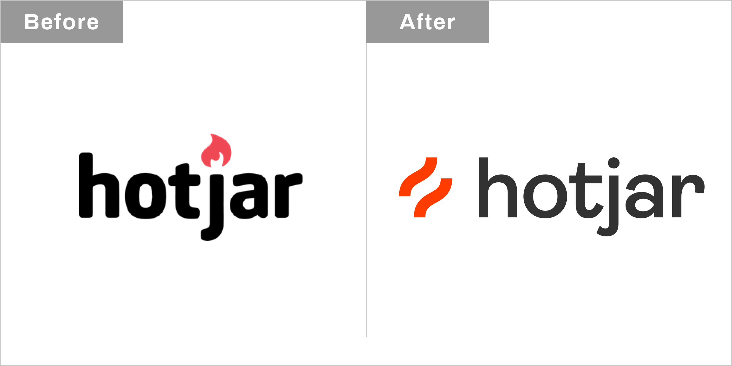
Logo
The previous logo had a small flame dotting the “j.” The new logo gets rid of the flame and adds some abstract waves and a new font. The waves are intended to evoke progress, motion, upward movement.
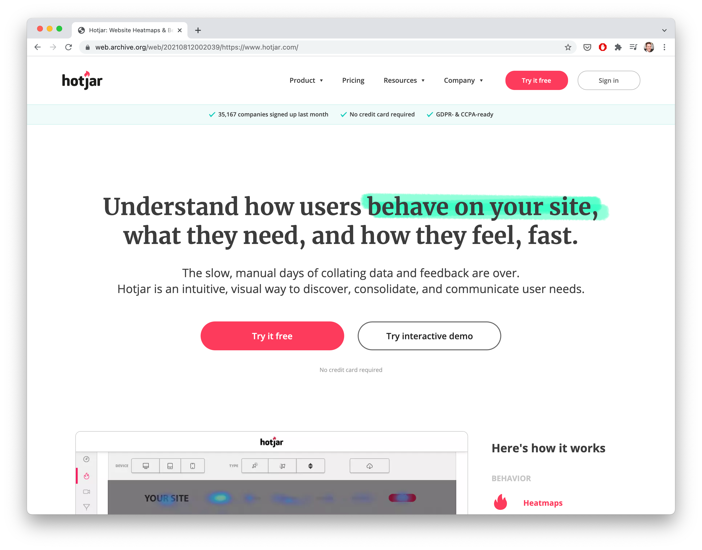
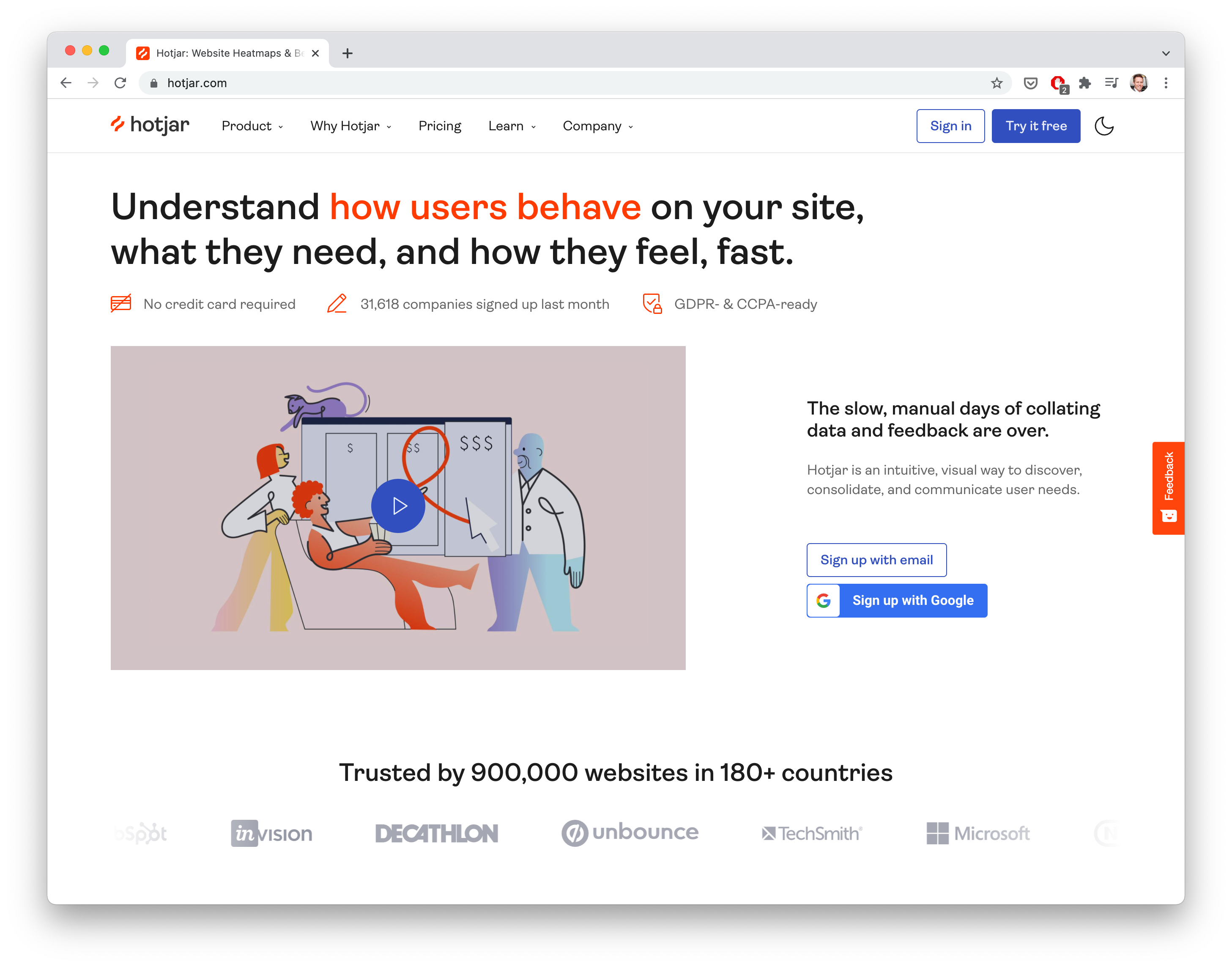
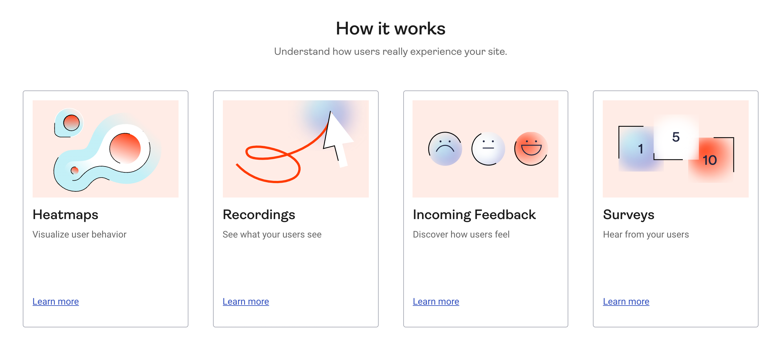
Website
Before:
After:
Visual identity

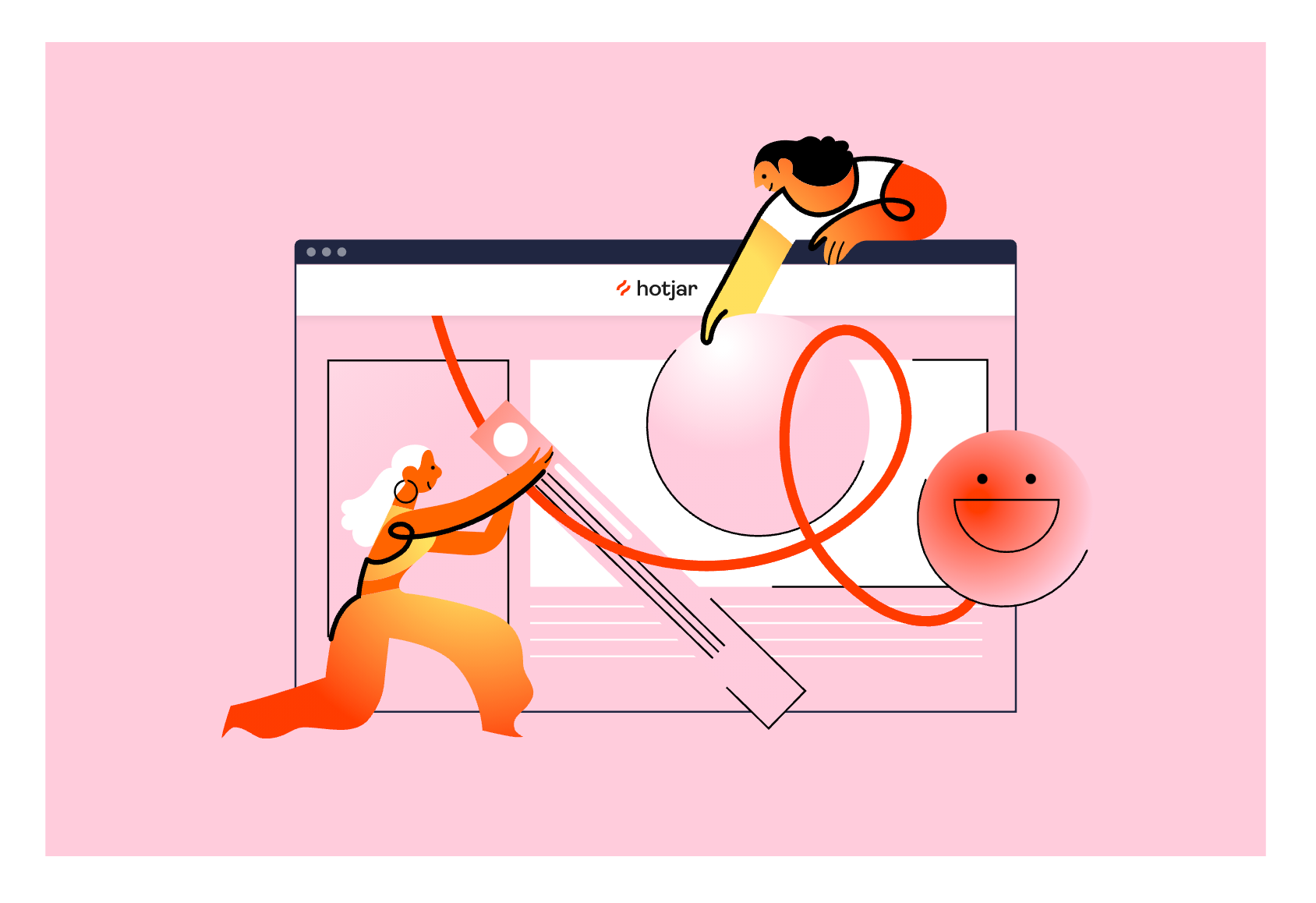
The new Hotjar visual identity has a lot of great thought put into it, and the new illustration style and colors are quite modern and fresh. More SaaS brands are moving in this direction, as you’ve probably noticed. One thing I love about the visual language is the inspiration behind the new color palette: Hotjar wanted to bring in the colors from flames, hearkening back to the original Hotjar logo.
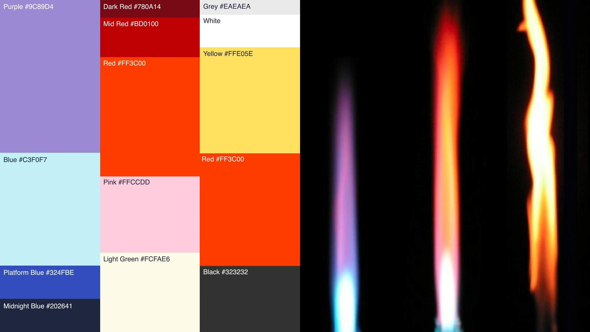
(I might not have made the connection myself had they not pointed it out, but now that I know it, I can definitely see the resemblance.)
Hotjar and the 3 P’s of branding
When I put together a brand strategy, I use these three P’s of branding:
Purpose
Positioning
Personality
For purpose, you’re attempting to answer the question of why? Why does your brand exist? Why does the world need you now? Ideally, you’re able to find a cultural tension that you can address with your product when it’s at its best.
What is Hotjar’s purpose?
Their stated purpose in the rebrand article is this:
We built Hotjar to inspire change through empathy. We imagine a world where all businesses treat you with love.
😍
I’d be really interested to hear what Hotjar believes is the cultural tension that exists around its product. The brand’s best self seems quite clear: empathy and love.
But what is Hotjar’s enemy? Here’s my best guess:
Positioning
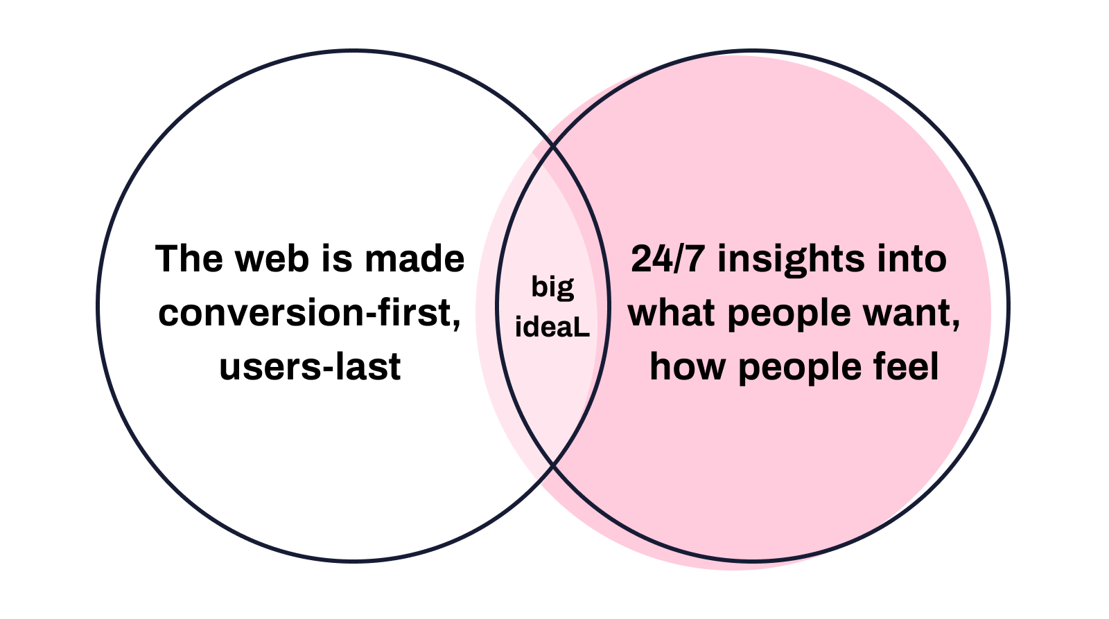
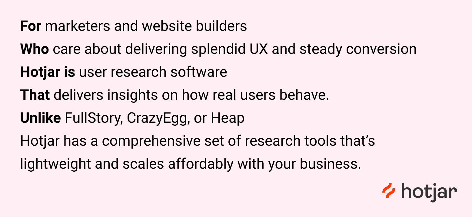
Along with purpose, I also find it helpful to articulate a clear positioning statement about what you are, who you’re for, and what makes you unique.
I have no idea what Hotjar’s actual statement is, but here’s my best guess:
What’s next? Hotjar, moving upmarket
One of the stated reasons for Hotjar’s rebrand was that they no longer wanted to be associated with purely just startups. Their userbase today has companies of all shapes and sizes, and they wanted a grown-up brand that was appealing to this variety.
The refreshed visual language is certainly a more mature direction for their branding. It’s suave and sophisticated — two things that more established companies in the midmarket space may find appealing.
(The only small quibble I’ll make about midmarket branding is the wordmark for Hotjar. Personally, I’m a big fan of capitalized brand names, particularly if you’re wanting to make your brand feel more established and grown up. We did this for the Buffer wordmark when we went through our brand refresh — going from a lowercase “b” in “buffer” to an uppercase “B.” Keeping the “h” in “hotjar” lowercase feels like the brand hasn’t quite taken that next leap yet.)
People will probably have lots of opinions about the logo. People always have opinions about logos. (My opinion: It’s not my style, but I do appreciate the story that went into it). What I found most interesting about this rebrand, though, is that the messaging stayed the same.
If you scroll back up to the website screenshots, the hero text is exactly the same in the before and the after. Maybe it’s for A/B testing purposes: You don’t want to change everything about a website all at once.
But if this rebrand was truly a plant-the-flag moment for Hotjar, I would have expected their core messaging to evolve as well.
When I was thinking on the positioning statement, I looked up Hotjar on G2. Their overview paragraph kind of shocked me:
Hotjar provides Product Experience Insights that show how users behave and what they feel strongly about, so product teams can deliver real value to them.
Hotjar is for product teams?
I think of Hotjar as a tool for marketers. I think of FullStory as a tool for product teams.
Even the Hotjar website still says that the primary use case is for website insights, which feel much closer to the world of marketing than the world of product.
Perhaps this is the next, next evolution of the brand? Sequencing from marketers to product people?
Does this Hotjar rebrand do it for you?
I’d love to hear your thoughts. Feel free to reply with any feelings or 😍
About this newsletter …
Each week, I share playbooks, case studies, stories, and links from inside the startup marketing world. If you enjoy what’s in this newsletter, you can share some love by hitting the heart button at the top or bottom.💙
About Kevan
I’m a marketing exec who specializes in startup marketing and brand-building. I currently lead the marketing team at Oyster (we’re hiring!). I previously built brands at Buffer, Polly, and Vox.
Not subscribed yet? No worries.
I send a free email every week or so. You can check out the archive, or sign up below:
Already subscribed? You’re in good company …
I’m lucky to count thousands of subscribers as part of this list, including folks from awesome tech companies like these:

Thank you for being here! 🙇♂️